

HOP SKIP JUMP
~
HOP SKIP JUMP ~

Hop Skip Jump
Event Design
Branding, Logo, Collateral, Social Media
Art Direction: Kelly Holohan
Hop Skip Jump aims to provide refugee children with a safe, inclusive, and stress-free environment to play and connect with other kids.
Many current outreach efforts for refugee children are geared toward learning and neglect the importance of kids having fun and relaxing. Refugees in America are often isolated from their native peers due to several factors, including the language barrier, PTSD, cultural differences, etc. Hop Skip Jump addresses this by giving kids an opportunity to bond in the universal language of play.
The Background

-
Design a brand identity for an event for a nonprofit, NGO, or charity organization. This is your opportunity to use design to make the world a better place. You will select a Nonprofit organization that aligns with the causes you care about. Your work will help this organization to more effectively engage with its principal audiences and speak meaningfully to their deeper needs, goals, and motivations.
-
The Refugee Youth Project (RYP) is a community outreach organization operating out of both the International Rescue Committee Baltimore Office and Baltimore City Community College. According to their website, RYP’s primary goals are:
Furnish Homework help, enhancing core academic skills, in a safe after school space
Provide refugee youth with the general and targeted practice of the English language
Promote creative self-expression to build self-esteem, and foster a sense of community among diverse populations
Educate the Baltimore community about young refugees and their families being resettled in the surrounding area
-
“Refugees are people who would prefer to return home but cannot do so because of persecution. While immigrants choose to leave their homes and come to the United States, refugees flee their homes fearing harm. As a humanitarian gesture by the United States government, a certain number of refugees are invited into the country each year. All refugees resettled in the U.S. hope to find safety, stability, and opportunity. Culturally sensitive services, as well as a warm welcome, can help them start to feel at home again.” (BRYCS)
-
I volunteered with The Refugee Youth Project from 2015-2019. I tutored refugee children ages 5–11 once a week. Because of my time at RYP, I have primary knowledge of the experiences refugee children often face in American communities. With that knowledge in mind, I wanted to create an event specifically for them. The majority of the programs RYP puts on for the kids are geared towards learning and enhancing their educational career which is important, but there is a key part of childhood that they are not addressing: fun.
Many of the children in this community have already experienced the pain of being forced to leave their home country in fear and being transplanted into a community and culture they do not understand. This type of barrier makes it hard for them to make friends and engage in activities. I wanted to address this aspect of the refugee experience and create an event that is accessible and fun for anyone that wanted to join in.
Early Stages
Vibe, User Personas, Moodboard
Vibe
When I am starting a large-scale project like this, I write a “vibe statement” that accompanies my idea. A vibe statement is a quick sentence that describes what I want my brand to feel like or communicate at first glance. My vibe statement for this project was:
Not Your School’s Field Day
Goals
It is fun
It is universally accessible and appealing
It fosters connections across cultures
It is something any kid would want to be a part of
User Personas
Moodboard
When looking for imagery to create the mood board I made sure to keep the main goals in mind. I chose to focus on imagery that had a saturated primary color palette and bold basic shapes to have universal appeal, and appear youthful without pandering. The mood board was also the foundation for developing the brand color palette. In examining the color palettes of brands that were similar, such as Lego and Kipos, I took cues from them to put together the brand’s bright primary colors.

Foundational Elements
Naming, Logo, Style Guide
Naming
Before diving into the design of a logo, a new brand needs the perfect name that encompasses its goals. It was important that the name referenced play and interpersonal connection.
I landed on the name Hop Skip Jump. It had a good rhythmic punch as well as associations with play actions. Hop, skip, and jump in conjunction also allude to the idiom “a hop, a skip and jump away” which means relatively close, referencing the overarching theme of closeness and connection.
-
I created a few word association lists with the words fun, play, and friends as the starting points. From this preliminary work, I expanded the list to include every potential name that came to mind and brought it to my peers for their reactions. They resonated with the name Pep Pop Pow because of its rhythm and how simple the words were. When asked why, one of my peers said, “The percussive nature of the wording makes it fun to say.”
At that point, I wondered, how do I capture the rhythmic fun of Pep Pop Pow and still achieve my goals of referencing play and connection? In researching action words that reference the act of play, I landed on the name Hop Skip Jump. It still had the rhythmic punch of Pep Pop Pow but felt more appropriate for the event. Hop, skip, and jump are all verbs that describe playing. Hop, skip, and jump in conjunction also allude to the idiom “a hop, a skip and jump away” which means relatively close, referencing the theme of closeness and connection.
Logo
Because the name of the event has such a strong meaning I wanted to use the letterforms as the basis of the final logo. I explored different typographic lockups of the words themselves as well as treatments to the type.

The typeface was a critical component of the logo design. It was important to capture something big and bold while still being friendly and inviting. After much trial and error, the typeface Bicyclette Ultra was selected because of its rounded edges and extremely heavy weight.
The final logo is a dynamic vertical lockup with symbols of play incorporated into the letterforms. I took a lot of cues for the iconography usage from Memphis Style design and patterns.

Patterns
When approaching the patterns, it was important to represent play but steer clear from any culture-specific imagery that may be inaccessible to some refugee children. I researched different international toys and games and decided on certain game motifs that were relatively universal: balls, jacks, checkers, blocks, dice, and slinkies. I mixed those motifs with basic shapes to create a system of bright patterns that could be applied across any deliverable. I also isolated some of the symbols to use across applications.
Style Guide
How Will Families Sign Up?
Website
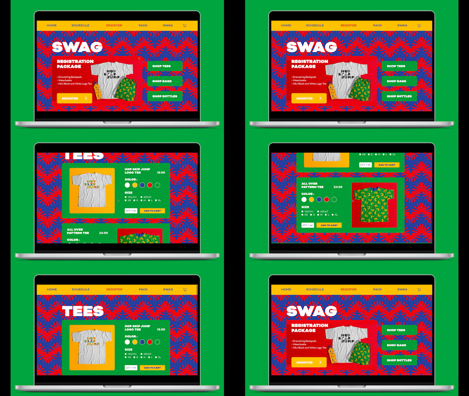
The website is the bedrock of the brand, it introduces the conventions that I would incorporate into the subsequent deliverables. The website’s purpose is to give information on Hop Skip Jump, facilitate registration for the event, and provide a place to purchase merchandise to raise funds for the organization.
My biggest goal for the website was to include sufficient information without losing any of the fun of the brand. I accomplished this by using large swaths of color and patterns in the background as well as large word lockups that echo the big playful nature of the logotype.
What Merch will the Kids get?
Tickets, T Shirts, Drawstring Bags, Waterbottles
Tickets

The ticket was one of the deliverables that I had a vision for from day one. I wanted the ticket to be something the kids could be excited by and would help spark communication. What better way to achieve that than by providing nametags that foster a sense of belonging?
The goal was for each nametag to feel fun and personal. There are touches from the iconography of the logo, but the space is more about the kids and the personal touches they choose to add. Each child would get a nametag at the beginning of the event and they would have the supplies to add their names and any other visual elements they choose. Then, throughout the day, kids would have an easier time approaching others because everyone would already know each other’s names.
Merchandise
The tee shirt was another deliverable that I had a vision for from the inception of this idea. One of my favorite parts of any field day, summer camp, or activity was getting the tee shirt at the end. I would always cherish my camp shirts and wear them with pride, making instant friends with anyone that recognized the shirt.
For Hop Skip Jump, every kid receives a cool shirt they can cherish and wear with pride. They also get to take it to another level and make their shirts uniquely theirs. The brand is all about bright colors and what better way to bring in some bright colors than by tie-dye! Not only would it create fun and unique designs but it would also empower the kids by making them feel like they had a hand in creating something for themselves. The initial shirt design needed to be bold enough to stand out against the tie-dye and leave enough space for the dye to shine.

On top of just giving the kids a tee shirt, the swag bag was designed to make them feel special and give them extra goodies that they could take home and use. With so many fun patterns, I thought it would be a shame not to give the kids something with a pattern on it. What merchandise would be both useful for and applicable to outdoor play? The solution included a water bottle and a drawstring bag.


How Will We Reach the Kids?
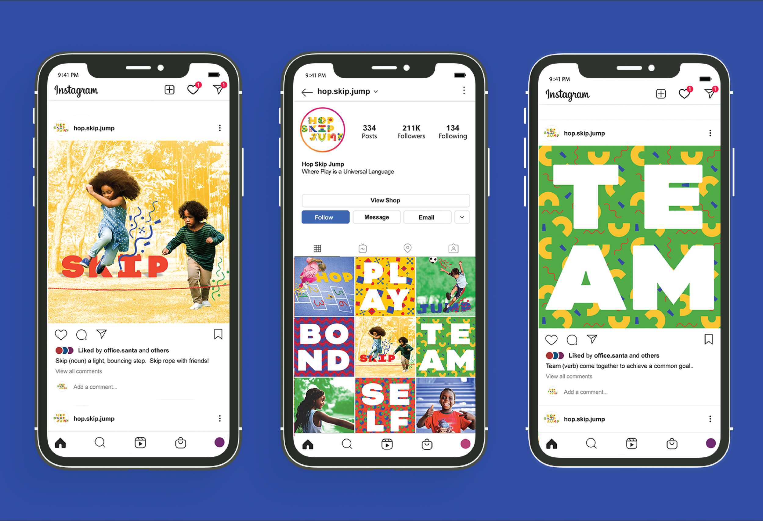
Instagram Presence
Social media was a chance to expand the brand into different design spaces and meet the kids where they are. I wanted the social media profile to continue the strong typographic presence but also introduce photography to create variety in the profile feed.
Final Thoughts
This project was a labor of love. I am incredibly grateful for the opportunity to reconnect with a cause that I care for so deeply. The brief gave me room to expand my perspective on what I can accomplish as a graphic designer and where I can use my talents for social good.